Using Mobile View
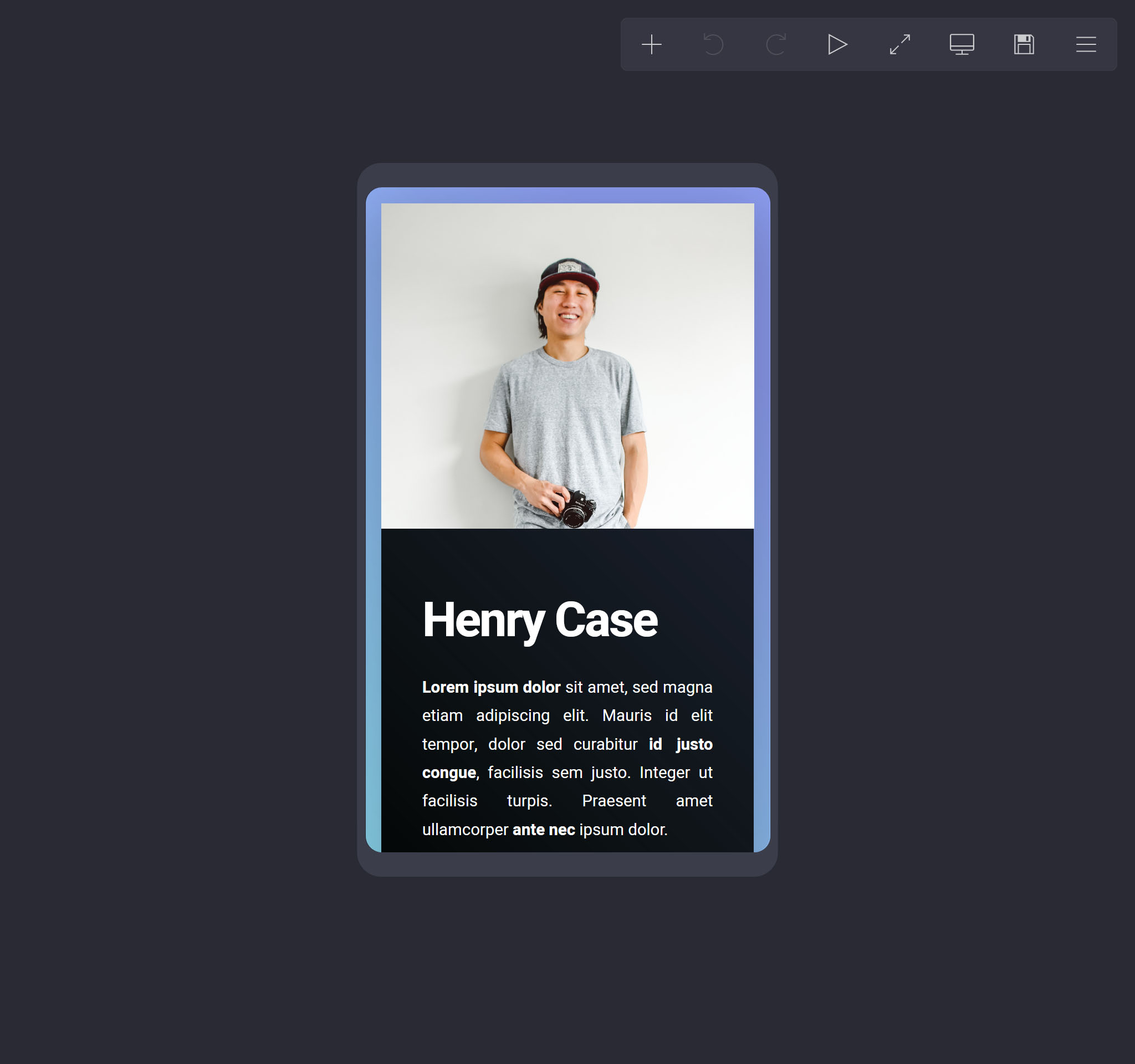
To quickly preview how a site will look on mobile screens, clicking Switch to Mobile View in the menu will switch the builder's canvas to a simulated Mobile View:
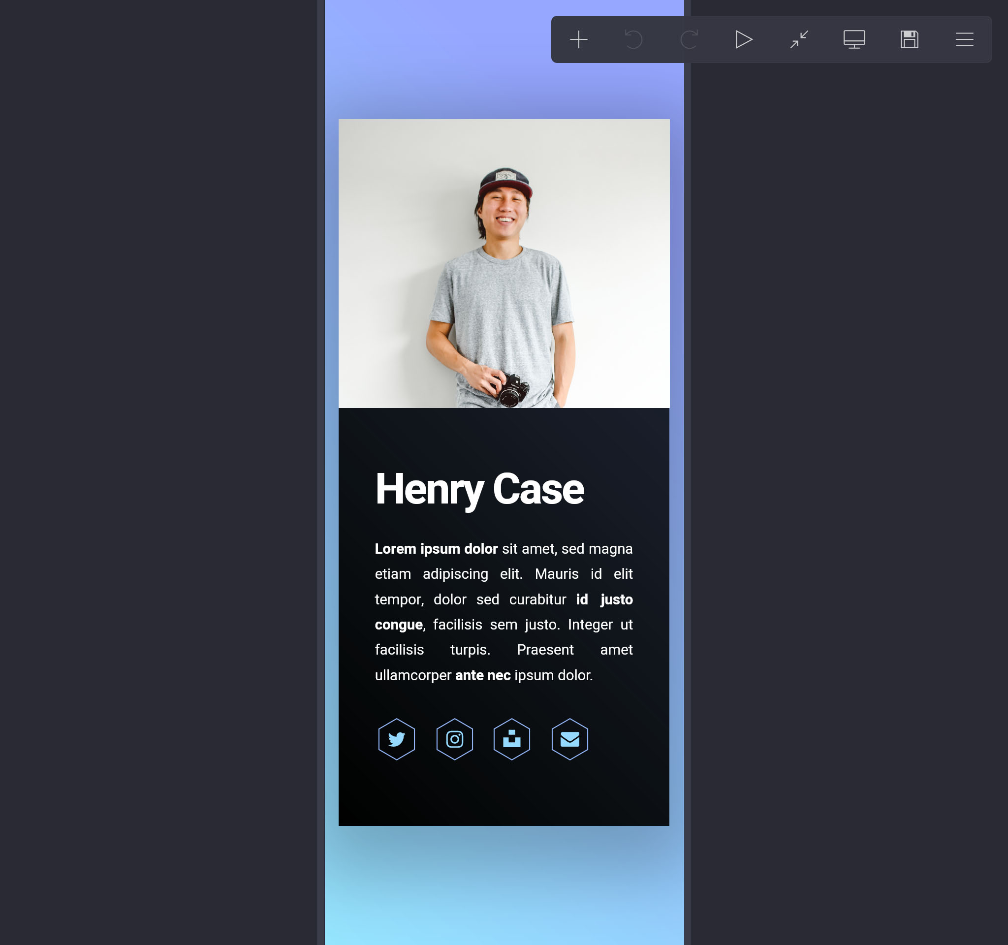
Once activated, optionally clicking Switch to Expanded View in the menu will uncrop the canvas and expand it to fill the height of the browser window:
Mobile view retains all of the builder's usual functionality so you can continue to work on the site while this mode is active. However, be aware that unless you're explicitly changing an element's mobile-only appearance settings, your changes will also impact how it looks in desktop view. To leave mobile view, click Switch to Desktop View in the menu.