Overview
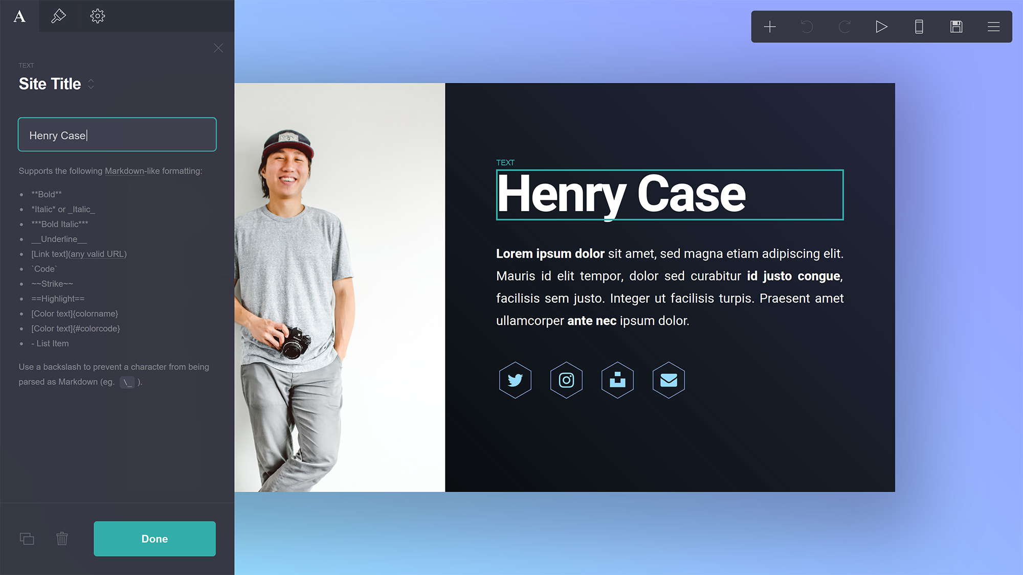
The builder is designed to be straightforward and simple, and while it's grown to include some interesting and useful features its basic interface has remained largely unchanged (in a good way! :) Here's how it breaks down:
Canvas

The most prominent aspect of the interface is the Canvas, and it's where you'll not only see a (mostly live) preview of the site you're building, but also what you'll use to move and arrange your elements as well as access two base elements found on every Carrd site:
- Background. The background of the site. Can be set to a solid color, a gradient, an image, or even a video.
- Page. Where all of the site's other elements live. Can be repositioned and styled in a number of ways.
Properties Panel

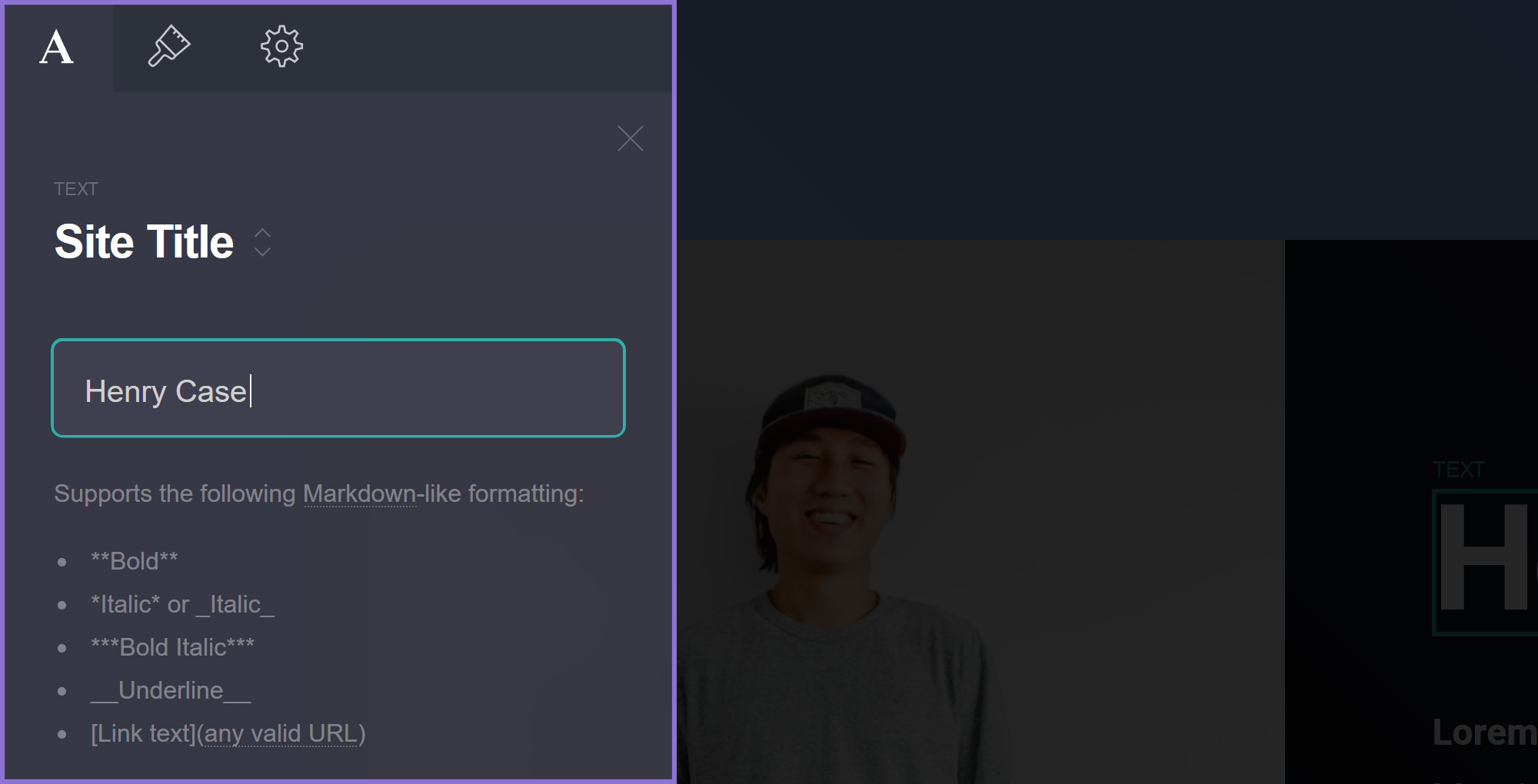
Clicking an element will bring up a Properties Panel with a number of tabs to manipulate and change its various properties and settings. The exact set of tabs will vary depending on the type of element you're dealing with, but most will generally have at least the following:
The element's Main tab with properties specific to its type (in this case a Text element).
An Appearance tab with all properties pertaining to the element's appearance.
A Settings tab with additional advanced settings (requires Pro Plus or higher).
Menu

And finally, the Menu is what you'll use to actually perform actions on the site you're building. Here's an overview of what everything does:
Add new elements to the site.
Undo the previous action.
Redo the next action.
Preview animations if any have been added.
Switch to Mobile View.
(Mobile View) Switch to cropped view.
(Mobile View) Switch back to desktop view.
Switch to Section View.
(Section View) Show all sections.
View the published site (or template demo) in a new tab.
Publish the site (and bring up its properties panel).